Ense features redesign

ENSE APP
Ense
Is about sharing your voice.
It is a social media app that allows users a way to comment and share their words with others.
Are you excited to make new friends, and hear about their lives.
Ense users record memos, share music, practice voiceovers, the uses are endless.
The Problem
Responding to others who use Ense. Users find it confusing to replying to other posted “Enses”. They get lost on the main feed and get confused about to what Ense to reply to.
This is also a UI issue the icons, are all one colour and do not change colours when activated or "new".
Solution
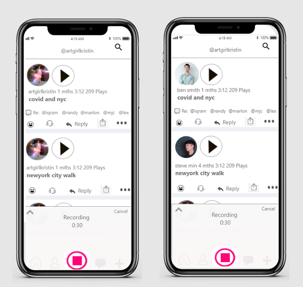
When recording new Ense users find the @handle of whom they are replying to show up.
A 3- or 4-word description of the Ense may also provide clarity.
UI issues alter the size of the icon for Private and add colour changing text for the first 24 hours for new posts.
A new hypothesis test after these updates will test if these improvements increased speed and les lessened frustration.

Home Page
Signed in home page Shows most recent “Enses” Users can scroll down to review infinite messages.
Problem #1
User scrolls down home page and wants to respond to others. User gets stopped because it is not always clear whom the user is responding to once responding starts.
Profile Page
Tap bottom image to go to your profile page. Here the user can listen to your Enses, reply to your own Enses, and review who you Ensed "DM'ed".
Problem #2
It is not intuitive. Occurs as confusing to the user who has Ensed back to another user.
A recent Ense has the same look as an older post and the impact is confusion can happen. People are visual.
Enses are audio recordings - There are no visual indicators so the experience is not as good as it could be.

Personal Profile Page
To Ense a response :
Tap the Pink Icon to record –
it turns into a square
User can record up to 5 min,
then it cuts off to post.
It is hard understanding
who or which Ense you are
Enseing.
Problem - is a new Ense being
posted for the first time?
or a reply to an Ense?
Personal Profile Page
Unheard Enses
The user can see other responses
during testing this is still a confusing
aspect of the app.
This slide shows the confusion
possible to responding to any Ense

Personal Profile Page
Solution: Include a “RE: “ with the users handle. We tested this revision with small sample of users.
Personal Profile Page
Once done with the recording 3 options appear Re-record, Delete, Never mind. The user then tags and hashtags a description of the recording.
Problem
A lot of space is not optimized. It is hard to tag followers, the app aggregates a list of followers, but the user can not clearly see who is listed.

Personal Profile Page
Problem
To make an Ense private (only the user can hear it) they must tap and select the Box for it to be kept Private. This box is very hard to tap the size is very small. You have to wonder IF the creator of the app is intentionally doing this so more people will keep Enses Public.
Solution
Make it bigger and move it so it is easier to tap
Personal Profile Page
Problem
Confusion when posting the test
Solution
Have the descriptive text be one color for the first 24 hours then change to black. Encouraging more on the spot conversation and ease of use.